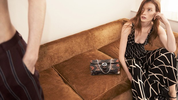
A while ago I had a major (third) interview with the advertising team of a major photographer whom I have always loved, but whose aesthetic, if being honest, is a long way from what I usually find stimulating. Think Vogue next to Sang Bleu and you’ll get a hint of what I mean.
I left the interview thinking I did pretty good overall, but with hindsight I know now I won’t hear back from them. This entry is about that hindsight and about the question which made me realise I wouldn’t be a good fit for their team.
To sum up the run-up to the interview, I did a hellava lot research and prepared a suavely designed presentation/proposal for a campaign, complete with moodboard, styling references and model options. I know this went down a treat, because they admitted they were impressed with the detail and the logic of the proposal, as well as the options I had chosen for the models. A neat trick I learnt during my photographer PA days is that when prepping for other photographers you have to try and put yourself in their shoes and think what they would like to see when deciding on casting or floor patterns for the shoot. Give them options. Not too many, as most artists are lovers of many things and can get easily confused, but a good enough range so it doesn’t feel like you just plonked the first five “boho” or “goth” girls you came across which fitted the brief.
I delivered my presentation in good time, didn’t use my notes and smiled through most of it. What went wrong then?
Rookie mistake. I spent a lot of time rehearsing my delivery and the potential connected questions I might be asked after but forgot to check THE NEWS. The marketing director didn’t have a lot to ask about the presentation because, as I mentioned, most of the side questions I had made sure were touched upon in the actual presentation. But at the end of it all, he just asked me, casually: “What do you think of the new Gucci Pre-fall campaign?” And that was that.
I couldn’t lie. I hadn’t seen it. It had just come out that morning. I didn’t want to babble so I just admitted to not having seen it and we moved on to other questions, which is why I thought it was all fine.
Then I got home and of course, curious, I checked the campaign. Wanted to see what it was all about. Photographed by Glen Luchford and styled by Joe McKenna. There it was, in all its glorified normcore beauty. I can see it. I understand, some weeks on, why people are still talking about it. It’s unglamorous and relaxed, it has all the right colours for a pre-fall collection. But I keep looking at it and because I can’t help rolling films inside my head, I have this vision of the art direction, from the perspective of one the female models in the shoot. It goes like this:
“Had some friends over, we had some rosé. I know you’re not supposed to like it, but we were still kinda hanging from last night so we needed some sugar. That boy came over too that we all slept with once. He’s such a d, always hangs out with his top off. We had some hash, dressed up from my Mum’s wardrobe and then took some shots on our iPhone. Sent them by accident to the CEO of Kering. They want to buy them for an ad campaign or something. We had some more wine to celebrate. I hope I won’t regret it.”
You see, I’ve never had a problem with pared down styling or natural, beautiful, window-lit photography. It has a place of its own in advertising because we’re still selling by the marketing research idea that people want to imagine themselves in those clothes and anything a bit too over the top will repulse top buyers who are proven posh traditionalists with little taste for the avantgarde. The problem there is of what we’re trying to sell. Expensive, slightly underdesigned clothes in a cheap, underdesigned environment. It’s screaming: we know it looks cheap, but you know it’s expensive. And while it’s a fresh take from the usual “we know it looks expensive. it’s because it is.”, I’m still struggling to see the appeal. American Apparel has done this before with a lot more sex appeal and a little more tonal grading.
This is how I knew I wasn’t going to get the job. The reason they asked me about this campaign wasn’t because they were mean and trying to test me (okay, maybe a little bit). They wanted to see if I understand the current advertising environment when it comes to selling clothes. They were saying, quietly: We loved it, do you get it?
And I get it, but I don’t love it.


